The User Interface Options (UI Options), or UIO for short, component allows users to transform the presentation of the user interface and content resources so that they are personalized to an individual's own needs and preferences.
UI Options does three things:
- places a preferences editor dialog, with a set of adjusters, in a collapsible panel at the top of the page; accessible through a button at the upper right corner of the page;
- instantiates a cookie-based Settings Store for storing the user's preferences
- acts upon the user's preferences

Try the UI Options demo.
Overview
The goal is to put together a website and allow visitors a way to customize the website presentation to their own personal needs and preferences. This tutorial will outline the steps needed to setup UI Options on a site.
These are the basic steps to add UI Options:
- Download and install UI Options
- Prepare your page
- Add dependencies to the page
- Add the UI Options component
The rest of this tutorial will explain these steps and assumes working knowledge of HTML, JavaScript and CSS.
Download and install the UI Options library
Download and install UI Options using one of the methods outlined in Getting User Interface Options.
Prepare the page
Add the Sliding Panel
The UI Options component includes HTML templates for all the controls, so it's not necessary to create any HTML for them.
Insert the preference editor markup at the beginning of the <body> tag to instruct UI Options where to render:
<body>
    <!-- BEGIN markup for Preference Editor -->
    <section class="flc-prefsEditor-separatedPanel fl-prefsEditor-separatedPanel">
        <!--
            This div is for the sliding panel bar that shows and hides the Preference Editor controls in the mobile view.
            A separate panel bar for mobile displays is needed to preserve the correct tab order.
        -->
        <div class="fl-panelBar fl-panelBar-smallScreen">
            <span class="fl-prefsEditor-buttons">
                <button class="flc-slidingPanel-toggleButton fl-prefsEditor-showHide"> Show/Hide</button>
                <button class="flc-prefsEditor-reset fl-prefsEditor-reset"><span class="fl-icon-undo"></span> Reset</button>
            </span>
        </div>

        <!-- This is the div that will contain the Preference Editor component -->
        <div class="flc-slidingPanel-panel"></div>

        <!--
            This div is for the sliding panel bar that shows and hides the Preference Editor controls in the desktop view.
            A separate panel bar for desktop displays is needed to preserve the correct tab order.
        -->
        <div class="fl-panelBar fl-panelBar-wideScreen">
            <span class="fl-prefsEditor-buttons">
                <button class="flc-slidingPanel-toggleButton fl-prefsEditor-showHide"> Show/Hide</button>
                <button class="flc-prefsEditor-reset fl-prefsEditor-reset"><span class="fl-icon-undo"></span> Reset</button>
            </span>
        </div>
    </section>
    <!-- END markup for Preference Editor -->


    <!-- the rest of your page here -->
    <h1>My Website</h1>
</body>
The <section> element in this snippet contains three things:
<div class="flc-slidingPanel-panel">: where UI Options adjusters will e created- a
<div class="fl-panelBar fl-panelBar-smallScreen">: where the sliding panel and button will be created for narrow screens (e.g. mobile) - a
<div class="fl-panelBar fl-panelBar-wideScreen">: where the sliding panel and button will be created for wide screens (e.g. desktop)
The elements in this snippet all have particular class names attached to them, and it's important to keep them:
- the class names starting with
flc-are used to identify the elements to UI Options; - the class names starting with
fl-are used for visual styling.
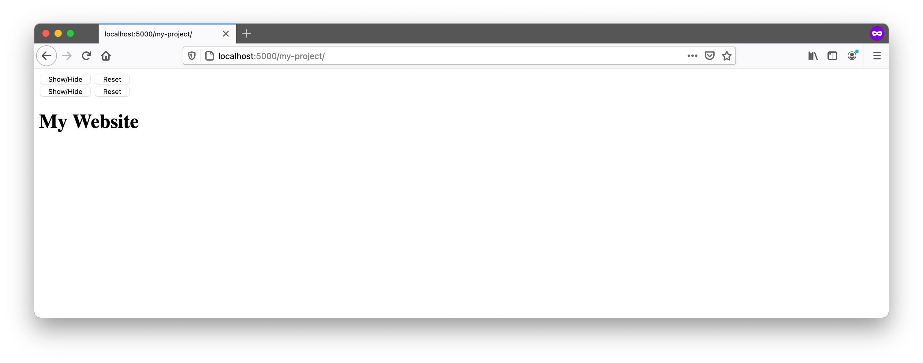
Save this file to the top directory of your project. If you open this page in your browser now, you'll only see the button in the upper left corner, since we haven't set up the CSS and UI Options isn't present on the page yet:

Add the Table of Contents
One of the UI Options controls allows users to add a Table Of Contents to the top of the page. You need to add a
placeholder <nav> to your page for the Table Of Contents. It should have a class of "flc-toc-tocContainer" and
should appear after the <section class="flc-prefsEditor-separatedPanel fl-prefsEditor-separatedPanel"> block:
<body>
    <!-- markup for Preference Editor -->
    <section class="flc-prefsEditor-separatedPanel fl-prefsEditor-separatedPanel">
    <!-- ... -->
    </section>

    <!-- the TOC container should appear after the flc-prefsEditor-separatedPanel container -->
    <nav class="flc-toc-tocContainer"> </nav>

    <!-- ... -->

    <!-- the rest of your page here -->
    <h1>My Website</h1>
</body>
It is recommended to place <nav class="flc-toc-tocContainer"> near the top of the page so it's visible and easily
accessible to keyboard users. Use additional classes to style the Table Of Contents to customize its appearance.
Add dependencies to the page
- the CSS files
- the main Infusion JavaScript file:
infusion-uiOptions.js.
In the <head> of your file, link to the CSS and Javascript files using <link> and <script> tags. Make sure to
adjust the paths to reflect where you've saved the Infusion package.
<head>
    <!-- CSS files for UI Options-->
    <link rel="stylesheet" type="text/css" href="lib/infusion/src/framework/core/css/fluid.css" />
    <link rel="stylesheet" type="text/css" href="lib/infusion/src/framework/preferences/css/Enactors.css" />
    <link rel="stylesheet" type="text/css" href="lib/infusion/src/framework/preferences/css/PrefsEditor.css" />
    <link rel="stylesheet" type="text/css" href="lib/infusion/src/framework/preferences/css/SeparatedPanelPrefsEditor.css" />

    <!-- The Infusion Library for UI Options -->
    <script type="text/javascript" src="lib/infusion/infusion-uio.js"></script>
</head>
infusion-uio.js is minified, (i.e. all of the whitespace removed), you can still debug the code
using the provided source map. For more information, visit
the Infusion Release Readme.
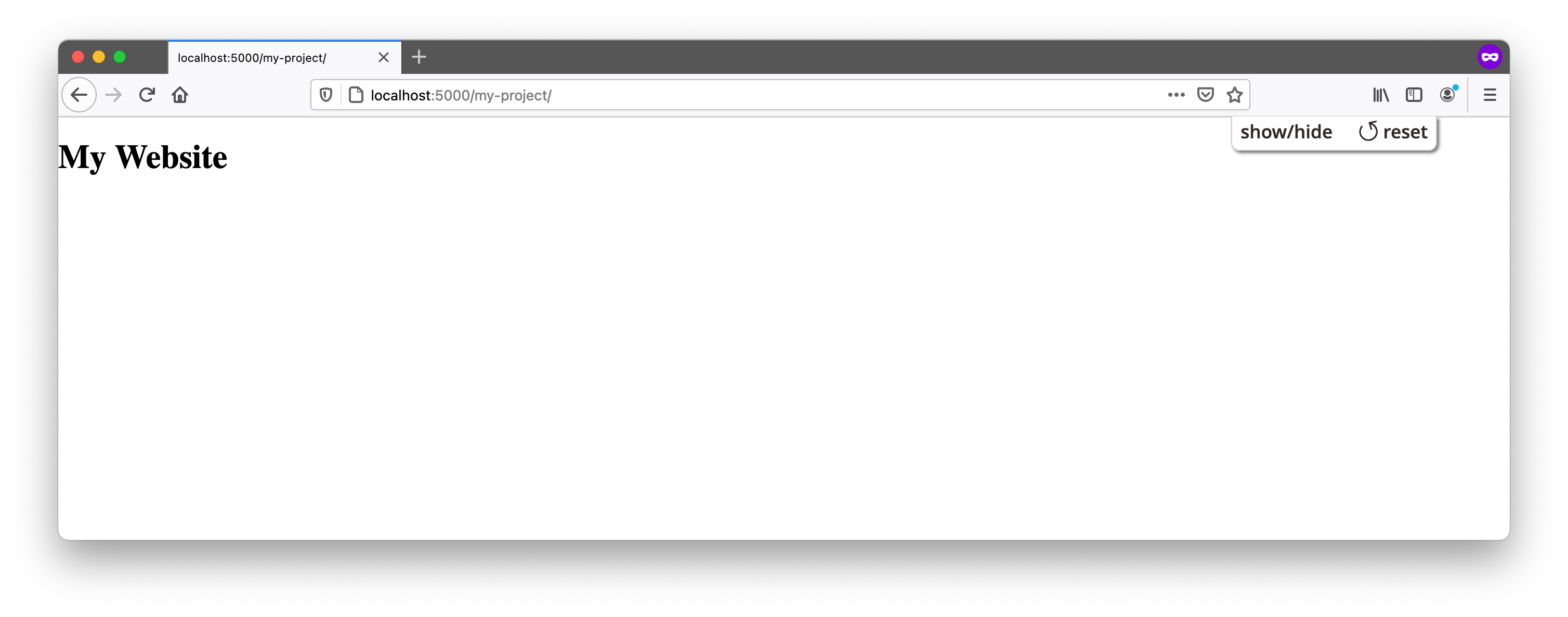
If you open this page in your browser now, you'll only see that the button has been styled differently: it is in the upper right corner and the font has changed. You can also see the bar of the sliding panel. The button still isn't functional, because we have yet to add the UI Options component to the page.

Add the UI Options component
Add the UI Options component to your page using a <script> tag. The code needs to run after the markup has loaded, to
ensure that the required DOM elements are available to bind to. This can be achieved using a jQuery's
.ready() method, placing the <script> as the last element in the <body>, or
importing the initialization code as separate JavaScript file with the defer
attribute set.
In this example, we place the <script> before the UIO markup and use jQuery's .read() method to ensure it runs after
the DOM is ready.
<head>
    <!-- ... -->
</head>
<body>

    <!-- Initialize the UI Options Javascript -->
    <script>
        fluid.uiOptions(".flc-prefsEditor-separatedPanel", {
            auxiliarySchema: {
                terms: {
                    "templatePrefix": "lib/infusion/src/framework/preferences/html",
                    "messagePrefix": "lib/infusion/src/framework/preferences/messages"
                },
                "fluid.prefs.tableOfContents": {
                    enactor: {
                        "tocTemplate": "lib/infusion/src/components/tableOfContents/html/TableOfContents.html",
                        "tocMessage": "lib/infusion/src/framework/preferences/messages/tableOfContents-enactor.json"
                    }
                }
            }
        });
    </script>

    <section class="flc-prefsEditor-separatedPanel fl-prefsEditor-separatedPanel">
    <!-- ... -->
    </section>

    <!-- the TOC container should appear after the flc-prefsEditor-separatedPanel container -->
    <nav class="flc-toc-tocContainer" aria-label="Table of Contents"> </nav>

    <!-- ... -->

    <!-- the rest of your page here -->
    <h1>My Website</h1>

    <!-- ... -->
</body>
This script calls the fluid.uiOptions() function to create the component. The function takes two arguments:
- the selector of the container for the component
- an options object for configuring the component
The selector for our UI Options component will be the classname flc-prefsEditor-separatedPanel of the <section> we
created earlier.
The options argument tells the component about four things:
auxiliarySchema.terms.templatePrefix- path to the UI Options HTML templates,auxiliarySchema.terms.messagePrefix- path to the message bundles / strings that will be used in the interface,auxiliarySchema.fluid.prefs.tableOfContents.enactor.tocTemplate- path to the Table of Contents template, andauxiliarySchema.fluid.prefs.tableOfContents.enactor.tocMessage- path to the message bundle / strings for the Table of Contents.
In the example, the auxiliarySchema.terms.messagePrefix option is referencing the default strings provided by the
component.
Complete Example
Here's the complete example from start to finish. This example assumes the Infusion UI Options library is located in the
lib/infusion/ directory.
<!DOCTYPE html>
<html lang="en">
    <head>
        <!-- CSS files for UI Options-->
        <link rel="stylesheet" type="text/css" href="lib/infusion/src/framework/core/css/fluid.css" />
        <link rel="stylesheet" type="text/css" href="lib/infusion/src/framework/preferences/css/Enactors.css" />
        <link rel="stylesheet" type="text/css" href="lib/infusion/src/framework/preferences/css/PrefsEditor.css" />
        <link
            rel="stylesheet"
            type="text/css"
            href="lib/infusion/src/framework/preferences/css/SeparatedPanelPrefsEditor.css"
        />

        <!-- The Infusion Library for UI Options -->
        <script type="text/javascript" src="lib/infusion/infusion-uio.js"></script>
    </head>
    <body>
        <!-- Initialize the UI Options Javascript -->
        <script>
            fluid.uiOptions(".flc-prefsEditor-separatedPanel", {
                auxiliarySchema: {
                    terms: {
                        "templatePrefix": "lib/infusion/src/framework/preferences/html",
                        "messagePrefix": "lib/infusion/src/framework/preferences/messages"
                    },
                    "fluid.prefs.tableOfContents": {
                        enactor: {
                            "tocTemplate": "lib/infusion/src/components/tableOfContents/html/TableOfContents.html",
                            "tocMessage": "lib/infusion/src/framework/preferences/messages/tableOfContents-enactor.json"
                        }
                    }
                }
            });
        </script>
        <section class="flc-prefsEditor-separatedPanel fl-prefsEditor-separatedPanel">
            <!--
                This div is for the sliding panel bar that shows and hides the Preference Editor controls in the mobile view.
                A separate panel bar for mobile displays is needed to preserve the correct tab order.
            -->
            <div class="fl-panelBar fl-panelBar-smallScreen">
                <span class="fl-prefsEditor-buttons">
                    <button class="flc-slidingPanel-toggleButton fl-prefsEditor-showHide"> Show/Hide</button>
                    <button class="flc-prefsEditor-reset fl-prefsEditor-reset"><span class="fl-icon-undo"></span> Reset</button>
                </span>
            </div>

            <!-- This is the div that will contain the Preference Editor component -->
            <div class="flc-slidingPanel-panel"></div>

            <!--
                This div is for the sliding panel bar that shows and hides the Preference Editor controls in the desktop view.
                A separate panel bar for desktop displays is needed to preserve the correct tab order.
            -->
            <div class="fl-panelBar fl-panelBar-wideScreen">
                <span class="fl-prefsEditor-buttons">
                    <button class="flc-slidingPanel-toggleButton fl-prefsEditor-showHide"> Show/Hide</button>
                    <button class="flc-prefsEditor-reset fl-prefsEditor-reset"><span class="fl-icon-undo"></span> Reset</button>
                </span>
            </div>
        </section>
        <!-- END markup for Preference Editor -->

        <!-- the TOC container should appear after the flc-prefsEditor-separatedPanel container -->
        <nav class="flc-toc-tocContainer" aria-label="Table of Contents"> </nav>

        <!-- the rest of your page here -->
        <h1>My Website</h1>
    </body>
</html>
Congratulations!
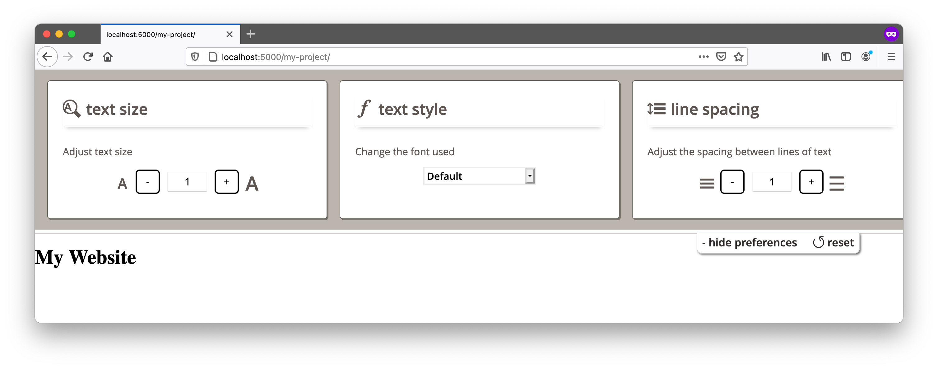
UI Options should now be fully functional on your page. When you load your page in the browser and click on the "Show Display Preferences" button, you will see the UI Options controls, as shown in the image below. If you adjust the controls, you will see your changes being applied to the page.

You may have to adjust your site's styles to work properly with UI Options. The "Working With User Interface Options" can help you get started.