Every Infusion application is structured as a set of components. An Infusion component can represent a visible component on screen, a collection of related functionality such as an object as in object-orientation, or simply a unit of work or relationship between other components. This page provides resources to help you understand components, how they're designed and how to work with them.
If you're creating an entire web application, your application would be implemented as a component that coordinates interactions between other components that handle the different parts of your application.
Examples
To help understand how a widget or application might be designed using components, consider some of the components in the Infusion Component Library:
Progress
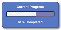
The Infusion Progress component is a single view component with no subcomponents. It has a number of UI elements that work together and are updated programmatically to show the progress of some activity. It has a pretty simple purpose and function, one that doesn't make much sense to try to chunk up into multiple components.
Inline Edit
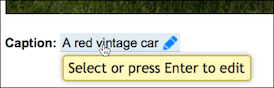
The Inline Edit component allows the user to edit text in place, without switching to a new screen, by simply switching into an in-place edit mode. The view mode is implemented one way, with certain functionality (i.e. a tooltip, an affordance to edit), and the edit mode is implemented differently: it's an edit field. Conceptually, these two modes are rather different, and so they're implemented as two separate subcomponents of the main Inline Edit component.
Uploader
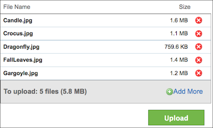
The Uploader allows users to add several files to a queue and then upload them all at once. It is actually made up of several subcomponents: It has the file queue view, which displays the files currently in the queue; it has a total progress bar at the bottom. In turn, the file queue view component has its own subcomponents.
What Does a Component Look Like?
A component is a regular JavaScript object that has certain characteristics. The simplest varieties of Infusion
Components, derived from
fluid.component, will have:
- a creator function
- the function that users of the component invoke, which returns a fresh component object
- this function is constructed automatically by the framework, given the options in the component's configuration
- configuration options
- various values that control the operation of the component, which can be overridden by implementors to customize the component
- public functions
- registered as
invokersin the component's configuration, these can be invoked by users to trigger component functionality
- registered as
- events
- registered as
eventsin the component's configuration, these can be fired and listened to by users and the implementation
- registered as
In addition, a component derived from fluid.modelComponent will
support:
- a model
- a free-form area where the component stores mutable state which is of interest to its end user
- changes in this area are managed by an automatically generated implementation attached to the component, a ChangeApplier, which allows interested parties to register and deregister their interest in particular changes, as well as allowing changes to one component's model to be automatically coordinated with changes in another.
Components which manage a view on behalf of their user, which is rooted at a particular node in the DOM, will derive
from fluid.viewComponent which then supports:
- a container
- a root element in the DOM to which the component's activity is scoped
- a DOM binder
- associating names with scoped selectors and the DOM nodes that they match
New kinds of components are created by passing configuration information to the
fluid.defaults function. This function will generate the creator
function that will be used to instantiate the component. The framework provides support for instantiating components
of various types, or 'grades'; as well, developers can create their own grades.
Simple example of defining and using a plain fluid.component
In this example, we will define a simple component which logs a message on startup, and create an instance of it:
// Define a new component by registering the JSON representing its options with fluid.defaults
fluid.defaults("examples.tinyComponent", {
    gradeNames: "fluid.component",
    listeners: {
        "onCreate.logMessage": {
            func: "fluid.log",
            args: "My tiny component has started up"
        }
    }
});

// Enable visible log messages in the console
fluid.setLogging(true);
// Create an instance of the component
var myComponent = examples.tinyComponent();
// Logs "My tiny component has started up" to the console
You can understand this example better by reading documentation for
fluid.defaults, fluid.log and
the Component Lifecycle.
Instantiating A View Component
In this section we instantiate a view component which is already defined in the framework, and configure it with some options of our own:
Example
var myInlineEdit = fluid.inlineEdit(".title-container", {
    styles: {
        edit: "demo-title-edit demo-edit"
    },
    strings: {
        defaultViewText: "Edit this",
        defaultFocussedViewText: "Edit this (click or press enter)"
    }
});